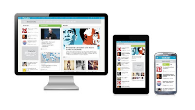
Has
the responsive design fever caught up with you, yet? The same web
design which appears wider at an instance and seems to intuitively
shrink itself the moment you shrink the size of the browser? Well,
this is not a gimmick on the part of web developers to hold users in
awe, but this is, what we predict, the need of the hour –
responsive web design.
 |
| Responsive Web Design - Need of Today |
Personal
computers, a soon to be things of a past!
We
have entered a critical dimension where the sales of smart phones and
tablets are taking over the sales of our good old friends, the
personal computers. Ever since 2001, 2012, for the first time saw a
decline in the projected sales, as compared to the previous year.
This is nothing but good news for the tablet industry as the sales of
tablets are expected to cross the 100 million mark this year.
Besides,
smart phones is a flourishing industry, and with key players like
Apple and Samsung readily coming up with new and much more power
packed and feature packed phones, who would want to go back to
immobile and bulky counterpart?
Responsive
Web Design – the deal clincher!
Given
the 1000s of varying screens a person may use to browse through your
website, the only solution left here is to build a website which can
slip through various multi disciplinary screens, with the same amount
of ease and perfection. Sounds crazy, right? But today, with the
advent of responsive web design services, you can very easily achieve
the same.
A
responsive web design makes use of the media queries and intuitively
figures out the resolution on which the device is working on. The
liquid fluid grids and flexible images then actively adjust
themselves as per the size of the screen. Thus, if you get to view a
responsive web design on your desktop, by shrinking the size of the
screen, you will have a responsive web design page shrink itself and
adjust according to the parameters of the browser screen. Sheer
genius it is.
The
benefit of a responsive design is pretty simple and straight forward
– you have to get it done for once, and then it will work
seamlessly across a wide gamut of screens.
Keeping
in mind the present day users and a wide variety of options available
with them to view your website, the responsive web design is nothing
but trampling on a pot of gold.
2013
is going to be responsive year, are you ready?
With
experts predicting the same increasing surge in the tablet and smart
phones industry and the fact that users find it much more convenient
and luxurious to read the news via mobile instead of apps, one can
safely presume that 2013 is going to be the year of responsive web
design. For a website owner, a responsive web design means an easy
way to reach out to a plethora of users, and for users, it means easy
flexibility to access information through a number of devices.
We
believe Ethan Marcotte, the author of Responsive Web Design, said it
best about its need when he said, "Now more than ever, we’re
designing work meant to be viewed along a gradient of different
experiences. Responsive web design offers us a way forward, finally
allowing us to 'design for the ebb and flow of things.'"
No comments:
Post a Comment